Whenever I use a payment machine for parking or a transit system, it’s like participating in a usability study.
Many of them are just hard to use, but I know it’s a complicated design problem. Why? Anyone can use them: natives and tourists; people who read well, don’t read well or don’t read the local language; new and experienced users, young and old, etc. And there may be a lot of tasks to include in the user interface.
Here are some examples of what I’ve seen
Boston’s multi-space parking meters
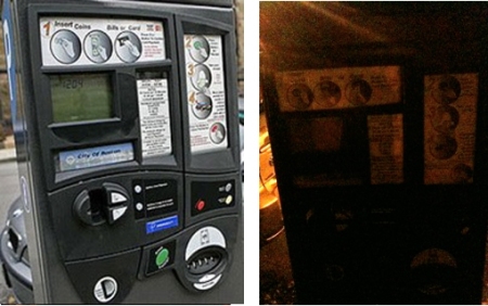
These new parking meters serve a number of parking spaces. Pay a fee, get a ticket, display it in the car. Simple, right? They work fine in the daytime but I struggled to read the instructions on a dark sidewalk. I saw a reference to “the green button”, but it was too dark to see color. And I could barely find where to insert the coins.

Boston's multi-space parking meter serves multiple adjacent spaces. It's easy to use in the daytime, but impossible to read in the dark
Providence, RI, airport’s parking machine
One of the big problems with these systems is simply knowing where to start. That was the case here.

Parking lot payment machine -- Providence airport
Parking machine at Mt Auburn Hospital (Cambridge, MA)
This worked pretty well. The steps are numbered (although not arranged in order) and it uses speech (do you remember DECtalk?). It started talking when I got close and guided me through the process well. It was loud enough for most people, but I don’t know if it uses other languages.

Parking garage machine, Mt Auburn Hospital, Cambridge MA
Washington, DC, metro (subway) payment system
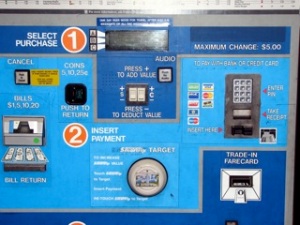
This was very confusing. I didn’t know where to start. As in other cities, they have people available to help customers. Do you think that’s necessary, or could they make it easier?

Washington, DC, metro (subway) ticket machine
New York City has multi-space parking meters like Boston’s
A friend sent this for my collection (thanks, John)

Multi-space parking meter, NYC
While we’re looking at NYC, here’s my favorite street sign
They came up with a great graphic to show why parking is prohibited.

Nice graphic on a no-parking sign in New York City
Family members know I’ll pull out a camera when I use one of these machines and they laugh. But I think it’s fascinating to see how different they all are, and to think about how much easier some of them could be.
Question: Have you seen machines like these? How easy were they to use? Did you feel like a usability study participant, too?
If you have any favorites images, email them to me and I’ll post them here.


 Posted by Hal Shubin