The City of Boston recently announced the Boston Meter Card, a prepaid card to use at parking meters. It’s a great idea, but it was impossible for me to figure out because the card doesn’t work the way other cards work. You have to insert the card and keep it in the meter for 10 to 15 seconds.
This post describes the problem, proposes simple ways to fix the problem at this late date and has videos of how the meters work.

How do you think it works?
How do you think it works?
What would you do when you walked up to a meter with the card? I thought about which way to put the card in, inserted it, took it out, and… nothing.
I was there with someone else, and we couldn’t figure it out. Was the card broken? Was the meter broken? What else could I have done?
Good thing I had quarters.
It doesn’t work the way you’d expect
When you insert the card, you have to hold it in for 10 to 15 seconds and wait while the small display updates a number of times. But you knew that, right?
Problem #1: It doesn’t work like any other card I use. I couldn’t figure it out. Was it user error, or a system-design problem?
Videos of using the Boston Meter Card
Watch video footage of checking in and out of a meter. It’s hard to read the display, but that’s part of the real-life situation.
Now that I know how it works, I understand the transitions in the display:
- 00:00 – there was no time on the meter when I arrived
- 25.00 – I have $25.00 left on the card
- In – I’m checking in
- 4:00 – the maximum amount of time to park
The first time I tried the card, it took the full 15 seconds to get a response. It didn’t display “In” that time, but it did display “1111” for some reason.
How long do you have to wait and watch? And how many changes will there be? Not knowing makes it hard to know when it’s complete. Is it clear what each display means?? There was no explanation, and it was impossible to figure out the first time. A brochure came with the card, but didn’t mention any of this.
Problem #2: The displayed information isn’t always the same for the same operation.
Checking out of the space was even more confusing because there were more transitions in the display to figure out:
These were the transitions for checking out:
- 2:18 – the time left when I got back
- 1111 – no idea, what do you think?
- 1:42 – the time I had parked and would pay for now
- 22.85 – the money I would have left on the card
- OUt – I was leaving
- 00:00 – the meter was reset and now had no time
Problem #3: There’s no way for a first-time user to know how many display transitions there will be, so there’s no way to know how long to wait before removing the card. (I think you have to wait, but I didn’t test that.) And it’s not clear what it all means.
It works like … nothing else
Even if you use an older ATM that holds on to your card, it reacts within a second or two. Most card-reading machines have instructions saying to “swipe” or “dip” the card; this was the only one that would use a word like “wait”. Here’s an example from a hotel I recently stayed at:

This hotel key card responded within a second. All I had to do was "dip" it in and remove it.
Using the card the first time
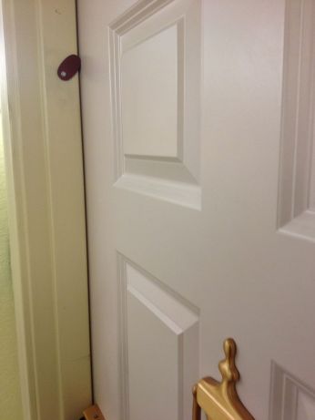
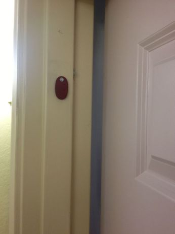
The first thing was to figure out how to insert it. This photo shows a graphic on the meter that corresponds to the chip on the back of the card. It’s hard to see and it’s not clear what it means.

The arrow points to a graphic that looks like the chip on the back of the card. Is that enough to tell you how to insert the card?
The sticker just below the slot would have been a good place to put some instructions. That would have been easier than trying to decipher that little mark under the slot.
Problem #4: The display is hard to read in bright light, and probably worse at night.
I inserted the card different ways, but it didn’t react (because I didn’t know to hold it in place). I spent a lot of time trying to make it work and a lot of time the next day on the phone finding out how it does work.
The problem: User error?
One person I talked with in the Parking Office said that it was “probably user error” because “that is the problem in 24 out of 25 cases.” I don’t generally believe in user error, so I took a deep breath and said that it’s more likely a system-design problem.
After awhile, I found someone who explained about having to hold the card in the meter for 10 to 15 seconds. I identified myself as a user experience designer, and we talked further.
More than user error, I think it was a failure to understand the users and their expectations.
Should a parking meter card need instructions?
He asked if I’d read the brochure that comes with the cards (PDF). This should be so simple that instructions aren’t needed. I don’t think people would read directions, save them or remember what they’d read. I mentioned that, and said that as a typical user, my copy was already in the recycle pile.
We talked about the instructions on the back of the card, too (ALL IN UPPER CASE) That text doesn’t say anything about holding the card in, it didn’t explain the transitions on the display and it didn’t explain when you’re done with a transaction. The brochure did mention holding the card in, but only for signing out.

The gold seal on the left must be the chip. The instructions at right ARE ALL UPPER CASE and don't mention holding the card in.
Problem #5: This system shouldn’t require documentation and what they provide is incomplete.
How can they fix this now that they’re already selling cards?
If the city doesn’t change something to make the system easier to figure out, I’m afraid that it will just fail.
It’s a system with many parts: the card, the display, the insertion method, the information on the meter and the brochure. Plus user expectations. Some parts are easier to change than others, but something has to change.
When I talked with someone in City Hall, I suggested reprinting the cards with complete instructions. He said that the cards came from the vendor. And that they had 10,000 of them. My card has a number in the 400s, so that won’t work.
Next, I suggested printing stickers with better instructions to cover the old text. Again, even if it were a lot of work, at least people would have the instructions with them.
It would help if the sticker on the meter had some instructions. I assume that changing the displays or how the meters work would be too involved, but we didn’t get to those topics.
We talked a little more and I wished him well.
Lesson: Design, test, redesign, test, …
Problem #6: The underlying problem is that the product design process probably didn’t involve any actual users or testing in real situations.
This is a system designed for anyone who parks a car at a meter, day or night, possibly in a hurry. How do you think someone like that reacts to this user experience the first time?
I don’t know who the vendor is, or who designed the system. And I don’t know how they’re going to resolve this problem. I’m pretty sure the program will not succeed without a big change.
I sent what I learned to Eric Moskowitz, the Boston Globe reporter who writes the Starts & Stops column about transportation issues. Maybe he can write a column and help teach people how it works.
It seems pretty clear to me that this whole system was designed the old-fashioned way. Rather than test the system with real users in real situations, they probably talked about it in a conference room and figured it would work out OK. If someone raised the obvious problems, I can imagine someone else saying, “Yeah, but all they have to do is…”
That phrase is the kiss of death for a design. I hope the City of Boston can make this project work because it’s a great idea.


 Posted by Hal Shubin


User reactions to self-service features: Is it “Hey, I already have a job, I don’t need to do yours, too”?
7 Sep 2012Companies obviously want to cut down on calls to customer care centers to save money. One way is to allow (force?) users to do more things themselves. We’ve been recovering passwords ourselves for a long time, and many products include other self-service tasks. Even libraries allow patrons to check out their own books.
In a recent design project, I was afraid that customers would dislike the self-service tools we were adding. I thought they might have the same reaction that I have to self-checkout lanes in stores: “Hey, I already have a job. I don’t want to check out and bag my own stuff here!”
But that wasn’t the case. Our users liked the new self-service tools.
We talked with a lot of users in usability studies and customer visits. They mostly had gotten good results when they called for assistance, but it seemed easier to do things themselves.
Calling customer care may seem like more of an interruption, while doing something yourself may seem more like an extension of what you’re already doing. Making the call requires a lot of work:
The early results for this product are good. It seems that customers are doing more tasks themselves, and the company is getting fewer phone calls.
Have you noticed that you’re doing more things yourself on the Web? What do you think about it? Are companies forcing you to do their work, or is it a time saver?
Share this: