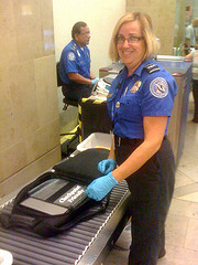
Does the Transportation Security Administration (TSA) do any usability studies to see how passengers react to security screening at airports? I don’t mean whether people like the different types of scans, but the whole process, from approaching the TSA area to getting their shoes and belts back on.
I have two problems: There’s never enough time and space to prepare, and I don’t really know what the rules are.

I try to prepare: liquids in one bag, prescriptions in another bag, a bag ready to empty my pockets into, shoes ready for removal, etc. But I always wind up at the conveyor belts sooner than I expect to. People are standing behind me, waiting for a basket while I’m trying to remember all the things I’m supposed to do. About half the time I forget to remove the bags with liquids and medications, and it doesn’t seem to matter.
Apparently certain mistakes can cause you grief. I read a story in the New York Times about a businesswoman pulled aside by TSA agents because the sundress she was wearing was too long (and could hide something) and because she didn’t make eye contact with the agents (after taking the red-eye from San Francisco to New York).
And I recently learned that cargo shorts pretty much guarantee a pat-down. Too many flaps, pockets, snaps and zippers.
So if I arrive at the conveyor belts and don’t do everything smoothly enough, will I be pulled aside for additional questioning or screening? That’s another part of the problem — no one really knows what the rules are. It’s like entering a new password on a Web site that doesn’t tell you the rules for passwords until you violate them. (That’s another blog post.)
I did find a reference to TSA doing customer research on its Web site a couple of years ago, but nothing about this.
Have you heard about any research into the overall process? Ignoring pat-downs and scans themselves, what would make the experience easier for you?


 Posted by Hal Shubin
User reactions to self-service features: Is it “Hey, I already have a job, I don’t need to do yours, too”?
7 Sep 2012Companies obviously want to cut down on calls to customer care centers to save money. One way is to allow (force?) users to do more things themselves. We’ve been recovering passwords ourselves for a long time, and many products include other self-service tasks. Even libraries allow patrons to check out their own books.
In a recent design project, I was afraid that customers would dislike the self-service tools we were adding. I thought they might have the same reaction that I have to self-checkout lanes in stores: “Hey, I already have a job. I don’t want to check out and bag my own stuff here!”
But that wasn’t the case. Our users liked the new self-service tools.
We talked with a lot of users in usability studies and customer visits. They mostly had gotten good results when they called for assistance, but it seemed easier to do things themselves.
Calling customer care may seem like more of an interruption, while doing something yourself may seem more like an extension of what you’re already doing. Making the call requires a lot of work:
The early results for this product are good. It seems that customers are doing more tasks themselves, and the company is getting fewer phone calls.
Have you noticed that you’re doing more things yourself on the Web? What do you think about it? Are companies forcing you to do their work, or is it a time saver?
Share this: